


WordPress has been working on a replacement for their default editor since 2020 and have come up with an entirely new concept which they call Gutenberg. In history Gutenberg is credited with popularizing the concept of movable type (the printing press) and the WordPress Gutenberg editor takes that concept and moves it into the “modern world”.
In Gutenberg every piece of content, whether it be a headline, plain text, an image, or a column group is expressed as a block and each block can be styled and moved around in a much more fluid and easy way than within the “classic editor”.
Compared to the classic editor Gutenberg looks much sparser at first glance:
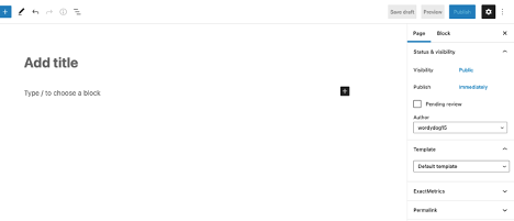
There are no toolbars or content controls just the prompt to type or choose a block and an inviting “plus” sign.
Clicking the plus sign will reveal a popup window showing the most commonly used blocks:
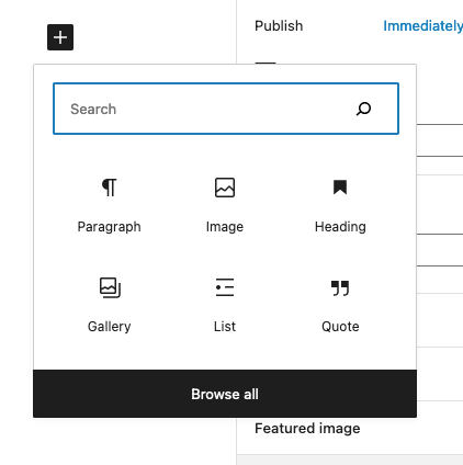
At the bottom of this popup you will notice a “browse all” link – clicking this will open up a left sidebar which shows every available block divided into categories. Once you become familiar with the block names, the search function can be used to call up specific blocks.
The block categories are:
- Text
- Media
- Design (blocks can be nested into the group or columns block)
- Widgets (please avoid these blocks – they are for functions that are still in beta)
- Theme (please avoid these blocks – they are for functions that are still in beta)
- Embeds
Each block has a set of controls:
Some are found in a set of icons above the block (when selected):
And other controls are found in the right column:
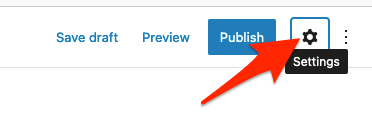
Note: if the right column is not visible click on the gear icon found in the upper right corner of the screen
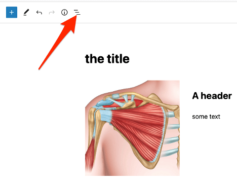
To see a list view of the blocks click on the list icon on the upper left section of the screen:
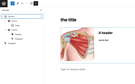
This will show a list view of the block in a left column display:

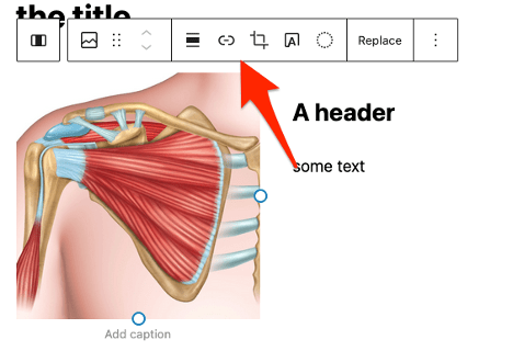
In the example above we are using the columns block to accomplish the layout with an image on the left side and a header & text on the right. The image and text are nested within the columns block.
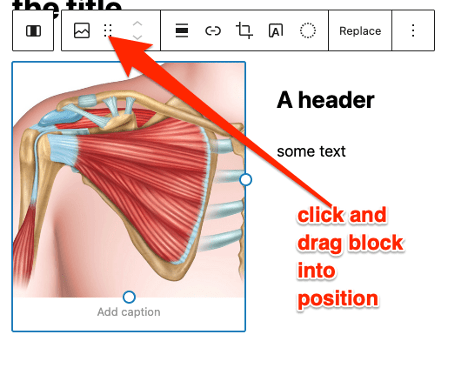
Blocks can be moved around by using the “drag” tool:
Blocks breakdown
Text Group:
Paragraph – body text
Heading – h1-h6 headings
List – either numbered or unnumbered
Quote – a pre-formatted quote
Classic – a block that uses the classic editor
Code – formatted to display code (we doubt you will use this)
Preformatted – similar to code (we doubt you will use this)
Pullquote – similar to quote with different formatting
Table – HTML table (in most cases the columns block is a better choice)
Verse – similar to quote with different formatting
Ninja form – will insert premade form
Smart Slider 3 – Will insert premade slider
Media Group:
Image – single image
Gallery – group of images
Audio – audio file
Cover – extra wide image (avoid use)
File – link to file in media gallery (think PDF)
Media & text – image & text combined
Video – video file
Design Group:
Buttons – preformatted buttons
Columns – structural block divided into columns
Group – structural block used as a container
Row – kind of a gimmick not worth using
More – kind of a gimmick not worth using
Separator – horizontal rule
Spacer – will insert space between blocks
Widgets Group:
Do not use the blocks in this group
Theme Group:
Do not use the blocks in this group
Embeds Group:
While the “embed” block will work for any embeddable media (like a YouTube video) there are specific embed blocks for most media types